
Derrick Buisch on monsters and squares
The Madison painter’s new show, “Monstercity,” runs through June 2 at the Memorial Union.
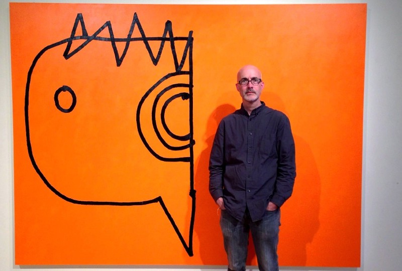
The Madison painter’s new show, “Monstercity,” runs through June 2 at the Memorial Union. (Photo: Buisch with his painting “Looker.”)
Derrick Buisch‘s new show at the Memorial Union’s Porter Butts Gallery, Monstercity, thrives on combustive two-color combinations and centers around Buisch’s ever-expanding set of 12″ by 12″ paintings of what he calls monsters—a years-long project of gnarled but unmistakably playful things that sometimes read as mutant creatures and sometimes as jagged Rorschach. The paintings have an off-the-cuff immediacy and take-it-or-leave-it approach to form that speaks both to Buisch’s past as a music fan and zine publisher in the late-’80s and early-’90s D.C. punk scene, and the conflicted relationship he’s developed with abstract painting in his years as an artist and UW-Madison art professor.
This show features a grid of 99 monsters, arranged to highlight certain pairings, relationships and recurring figures that aren’t always readily apparent but fun to try and puzzle out. The seven other works in the show sometimes build off the monsters idea in a larger format, like the orange-and-black “Looker,” and sometimes go for something completely unrelated, like the stately, reflective landscape “Canyon.” Buisch met up with me recently to talk about the show, which runs through June 2.

“Canyon.”
Tone Madison: You’ve displayed many of the small “monster” paintings at previous shows, but for this show you’ve expanded on the set and kept playing on that theme. What compels you to use this format, where you’re riffing on a theme over and over again?
Derrick Buisch: I’m hoping it does kind of two things at the same time. I’m hoping it feels spontaneous, and then at some point I want people to understand that they’re all the exact same size. I’m using sort of an order to regulate them. But the two things that I compare them to, that I go back to, I had a comic book collection that transitioned to an LP collection and I still have a vinyl fetish. So there’s that whole experience of going to the record store and standing in front of the wall of records, and there’s sort of a desire, lust factor, and how an album is designed, and the physical presence of a record. The other part is, I see it as this ongoing project, kind of a growing index, and part of it is, how many can I make? And I’ve done this in the past with other series. And the challenge is, can you keep making them, can you keep passing the threshold of burning out on it? The target number at the moment is 999.
“Monster (2 Headed Snake” and “Monster (Martian Radio)”
Tone Madison: So you’re saying you pursue an idea until you get sick of it, and then still keep at it?
Derrick Buisch: Yeah, pretty much. It comes and goes. It comes in waves. But I guess what I don’t want it to become about—even though on some level it might be—I don’t want it to become about an endurance test. I saw this thing on the Internet today, from the woman who wrote the book Wild [Cheryl Strayed]. She had an advice column earlier in her career, and she answered this letter from a young writer who was burned out and couldn’t write. And point for point, her advice was excellent. I don’t want this to be about work ethic. On one hand, it is about the amount of things, and things kind of building mass, but I’m hoping that the true nature of it is that there’s some level of joy and fun to it. I don’t want it to get dreary. And then there’s also a level of invention. I’m hoping that one of the things that’s revealed in looking at them for a while is that there’s ways that they’re done differently. A lot of them are done with projections straight from Xeroxes of sketchbook drawings.
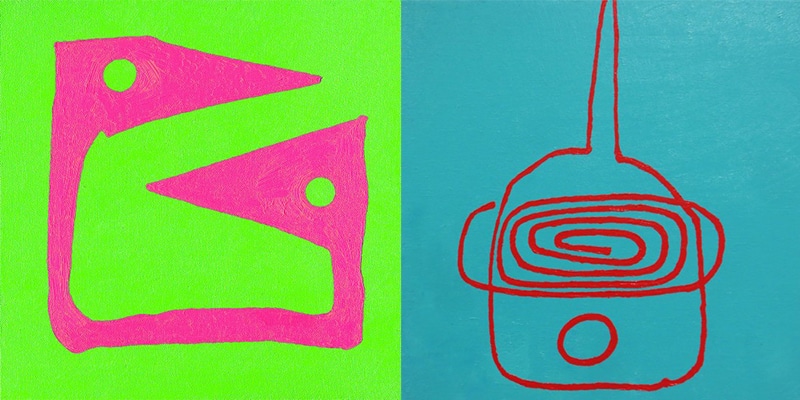
Part of what motivates me is my extreme dislike of winter, so all the bright colors are straight-up medicine for seasonal-affective disorder. I mean, I think about Florida, Mexico, Brazil—warm places where people have no inhibitions about painting their house hot-pink. In this part of the world, if I paint my house hot pink, I’d be downtown filling out some kind of citations. Other parts of the world, it’s a given that you’re going to have hot colors. So, color’s a motivator. And then, in response to that, there’s a couple black-and-white paintings of the show just to sort of not have the show going all 90 miles per hour full-blown.
Tone Madison: With some of the monsters, you can tell it’s supposed to be a creature, and some are way more abstract and don’t initially call that to mind. Is there an added dimension of playfulness in that?
Derrick Buisch: Yeah, absolutely. I keep sketchbooks and I draw pages of these, and at some point the variation, some of them get so beyond the monster thing it’s hard to sort of understand out of context that it’s a monster. These are all done from one or two sketchbooks, so as I’m going through to try and pick, I’m also looking for ones that sort of go beyond the threshold of a monster head or monster body. Some of them, outside of this set, without a title, would maybe just be scribbles or furniture. There’s one along the bottom that reminds me of a grand piano. I’m hoping that people come to any of this work and they come with an open mind and a sense of playfulness and imagination, and have freesociative territory, and can just sort of brainstorm: Is it a piano, is it a helmet, is it a lobster? Just that game of trying to figure out what it is.
Tone Madison: What relationship does the big orange and black painting, “Looker,” have to the monsters set?
Derrick Buisch: Direction’s really important in the way the show’s installed. If we think of that as a head, it’s looking at [the monster grid], and then there’s the blue scribble on the pink paintings coming back into the room. I did a couple of site visits, and I wasn’t even paying attention about the trees out the windows, but I knew I wanted a black-and-white painting between the two windows. I’m trying to figure out ways of magnifying the forms so I can see if they work big as well as small, and I don’t want them to always be locked into a square. A square is kind of a maniacal thing. I have a mixed relationship with squares. I have a love-hate thing with squares. As I got bigger with the work, I didn’t want to feel like it always had to be square, and certainly the orange one and pink one [“Brazil”] are playing with negative space, and my impulse is to put everything right in the center and have it designed like a T-shirt, like an icon, so those painting are about pushing those out and what happens when something’s not in a square and there’s some space around it.
“Looker” has some textured brush marks, and it’s not too much of a reference to the LP record, but there’s some kind of a flavor of that, the grooves. On one hand, from a distance, I want it to feel really graphic and super-simple, and then when you get up close I want you to see the stops and starts and stutters.
We can publish more
“only on Tone Madison” stories —
but only with your support.
Author

Related Articles

Creating a music community on the isthmus with “Evan’s style”
Musician and arts organizer Evan Fernandez discusses the importance of managing the HQ practice space for local bands and his own ensemble, The Porch Flowers.
“Limerent Pittsburgh” intricately constructs a folkloric affection of place
Artist Anne Ciecko’s 2025 videopoem is a highlight among the 30 selections of this year’s Midwest Video Poetry Fest at ALL on April 4.
Good birding in all seasons with the storied Charles “Chuck” Henrikson
The retired lecturer and winsome ornithologist has been coordinating Tuesday birder hikes at the Arboretum for well over a decade.