
Vast and hallucinatory worlds at the Chazen
“Fantastic Illustration” captures the ambition of commercial sci-fi and fantasy artists.
“Fantastic Illustration” captures the ambition of commercial sci-fi and fantasy artists.
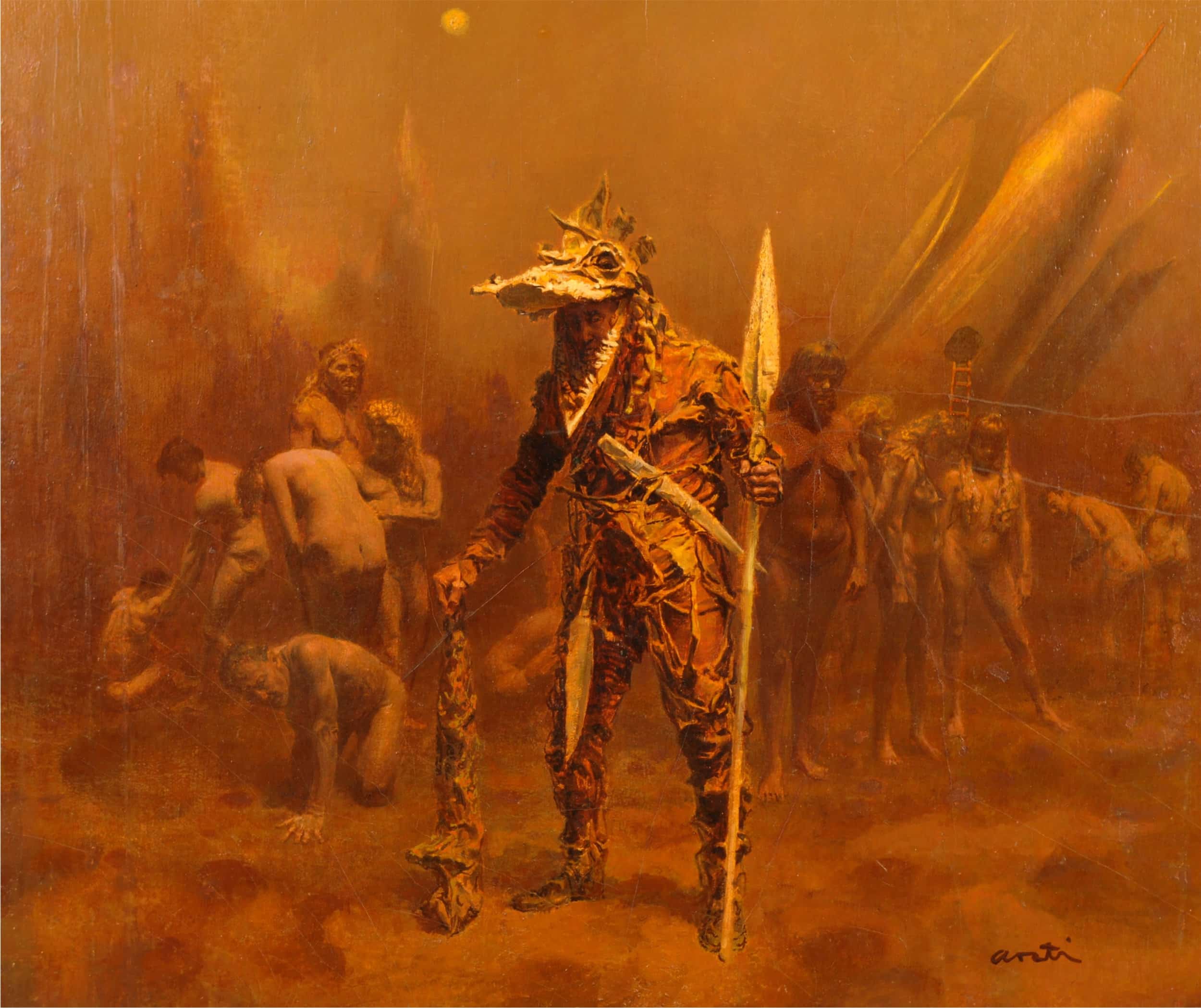
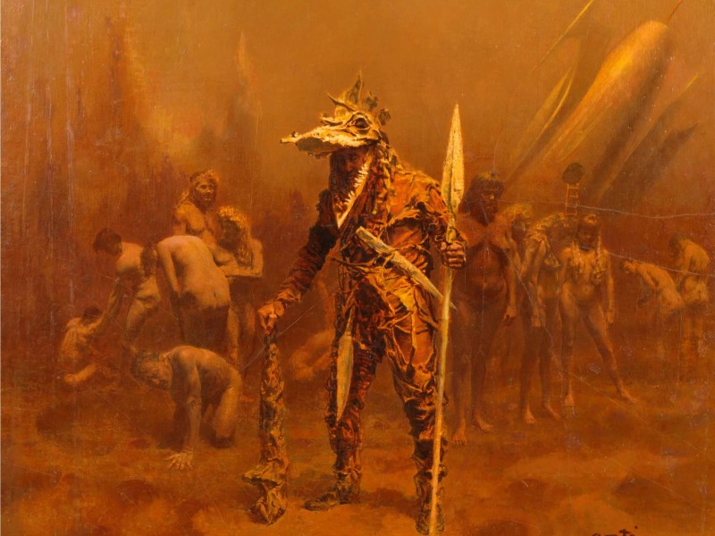
James Avati, “Deathworld 2.” Image courtesy Chazen Museum of Art and Korshak Collection.
Science fiction and fantasy have striven for, and often attained, something higher than the tawdry commercial status pop culture still assigns them. The striving is on vivid display in a new show at the Chazen Museum of Art. Fantastic Illustration From The Korshak Collection, on display through February 4, comprises works created as cover art and internal illustrations for American fantasy and sci-fi novels, and earlier European pieces that accompanied popular editions of works ranging from Shakespeare’s The Tempest to Edgar Allan Poe’s stories. The works are drawn from the collection of Stephen Korshak, whose father was a sci-fi publisher; you can read more about the collection itself in a recent Apex Magazine Q&A.
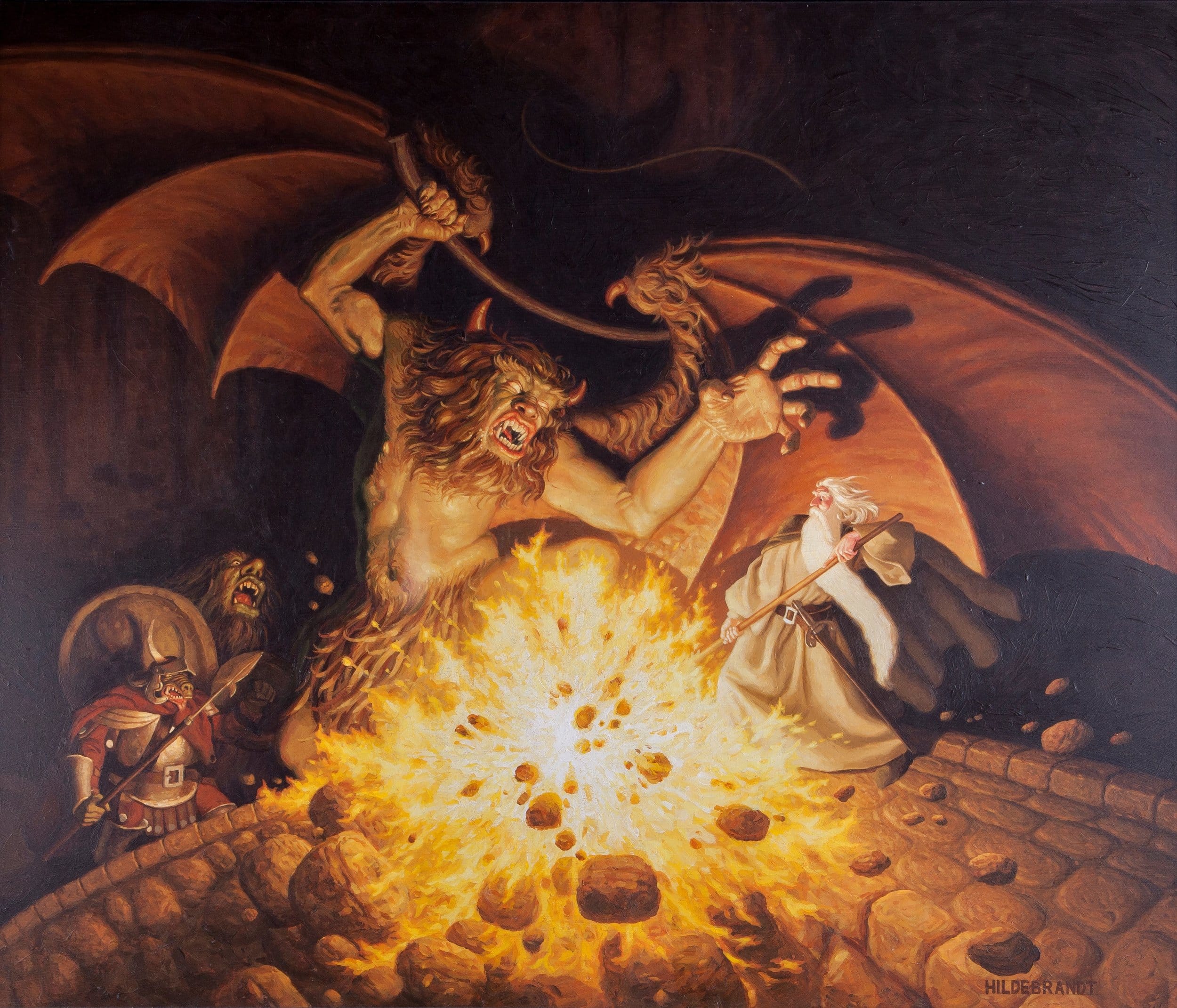
Here the artworks are largely presented as stand-alone pieces, their ambitious yearning liberated from commercial context. (There are some examples on display of finished books and magazines that used the works.) Hannes Bok drew publishers crazy by taking too long to finish his work, Chazen curator Drew Stevens explains, and had ambitions to produce his own Dalí, which one cannot miss in his painting for Roger Zelazny’s story “A Rose For Ecclesiastes.” Walking through the exhibit mid-installation in early November, Stevens marveled at Bok’s “insanely fine style that he just can’t help but deploy,” and the sheer size of the Brothers Hildebrandt’s “The Balrog,” initially published as part of a 1977 J.R.R. Tolkien calendar.


Yet commerce hovers in the margins of the show. Many of the works in the show were also repurposed for the covers of multiple novels, which highlights their commercial malleability but also encourages viewers to develop their own interpretations and narratives. Each work to one extent or another evinces the processes and needs of publishers in its time, whether it’s Aubrey Beardsley’s use of photogravure in an 1894 illustration for an edition of Thomas Malory’s La Morte d’Arthur, William Timlin’s use of the “gift book” format in 1923’s The Ship That Sailed To Mars, the open spaces left for text to be superimposed later on most of the late-20th-century pieces, or the varied forms of prurience dotting the American half of the show.
“It seems to me that there’s a difference between the science-fiction prurience and the sword-and-sorcery fantasy,” Stevens says. “A lot of the difference lies in the male character. In someone like Frank Frazetta or the granddaddy of them all, J. Allen St. John, there’s all these men in loincloths out to save the girl and save their world.” On the other hand there are exaggerated female figures in gauzy gowns or improbably revealing space suits, though perhaps fewer than one might expect. This tiresome sexualized imagery points to the show’s one fatal flaw, which is that it doesn’t quite reflect the diversity of sci-fi and fantasy writers, nor their diversity of thought.

Thanks in part to the different time scales of the show’s European half (1860s to 1980s) and its American one (1930 through 1990s), Fantastic Illustration boasts a range of arresting experiences. In a 1919 pen-and-ink drawing for Poe’s “The Pit And The Pendulum,” Irish artist Harry Clarke works in all black-and-white to create an ornate image foregrounding the narrator, who is wrapped in strangely elegant bindings and surrounded by rats—as if the pendulum were the least of his worries. John Schoenherr’s cover illustration for a 1968 paperback edition of Frank Herbert’s The Heaven Makers could pass for a Slayer album cover, with its blasted-out reds and forbidding humanoid focal point. The Swedish-born Gustaf Tenggren, who would go on to illustrate children’s books including The Poky Little Puppy and work in Disney’s animation department, evokes Goya’s more eerie works in his 1922 painting “The Witch From Karlekens Under.” Curator Stevens admires the use of “space bagpipes” and concentric sound-circles to subdue an alien horde in Kelly Freas’ cover illustration for a 1954 edition of Planet Stories magazine. And J.K. Potter’s “Alive And Screaming” was made for NOPE memes.
That said, there is one piece here that triumphs above all, and is justly foregrounded in the show’s promo materials and on the Korshak Collection’s website. James Avati’s 1964 cover painting for Harry Harrison’s novel Deathworld 2 depicts a scene of all-smothering but finely layered red-brown dust. A figure in a tattered suit with a headpiece resembling giant reptile jaws leads a weary, uncertain group through the rusty cloud. The painting captures the mix of humanity, melancholy, and disorientation readers find in the best science fiction.
“There’s a considerable amount of nudity in the background…but these are not very idealized nudes,” Stevens says of Avati’s painting. “This is a transformation from previous book-cover illustrations—people are middle-aged, slightly overweight, and really in a different sort of artistic vision. Science fiction was transforming into a different kind of medium at that point, and became a lot more introspective and a lot more bleak—at least in America. Bleak science fiction goes way back.”
The range of works, Stevens says, also reflects the battling schools of thought about how plausible sci-fi and fantasy illustrations should be. But don’t go into this show worried about plausibility. Just stay open to the hallucinatory richness of a collection of works that largely do deserve to stand on their own.
We can publish more
“only on Tone Madison” stories —
but only with your support.
Author

Related Articles

Creating a music community on the isthmus with “Evan’s style”
Musician and arts organizer Evan Fernandez discusses the importance of managing the HQ practice space for local bands and his own ensemble, The Porch Flowers.

“Limerent Pittsburgh” intricately constructs a folkloric affection of place
Artist Anne Ciecko’s 2025 videopoem is a highlight among the 30 selections of this year’s Midwest Video Poetry Fest at ALL on April 4.
Good birding in all seasons with the storied Charles “Chuck” Henrikson
The retired lecturer and winsome ornithologist has been coordinating Tuesday birder hikes at the Arboretum for well over a decade.